
Case Study
Case Study
Case Study
Reuthe's Lost Gardens of Sevenoaks
Objective
Refining the brand that was established in 1902 for the "Lost Gardens of Sevenoaks"
Type - Branding
Reuthe’s (pronounced 'Roiterz') Lost Gardens of Sevenoaks is, as its name suggests, a hidden gem of a place set on the sandhills of Sevenoaks, just off the A26 in Seal. Its new owner was introduced to us through another client and we soon were tasked with providing our design services.
We first needed to organise the branding, as there was no information about colour and mismatched print across the site, there was a dark green used everywhere but no refenrence to measure it by. So, we agreed the final bottle green Pantone colour and then created a secondary palette to rebuild the branding for what was to come.
A secondary logo was derived to include the “Lost Gardens” element as this held some intrigue and mystery and would be a pull for the site. We also created some rules around how the icons and main logo would be used going forward so as not to muddy the brand message.
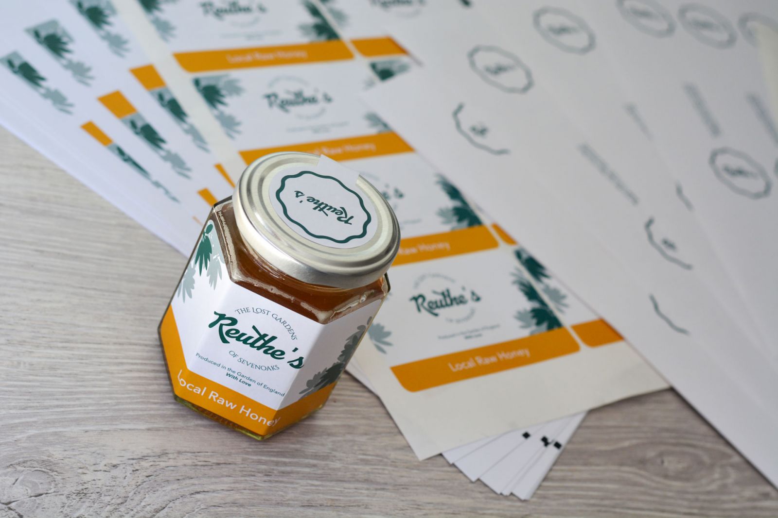
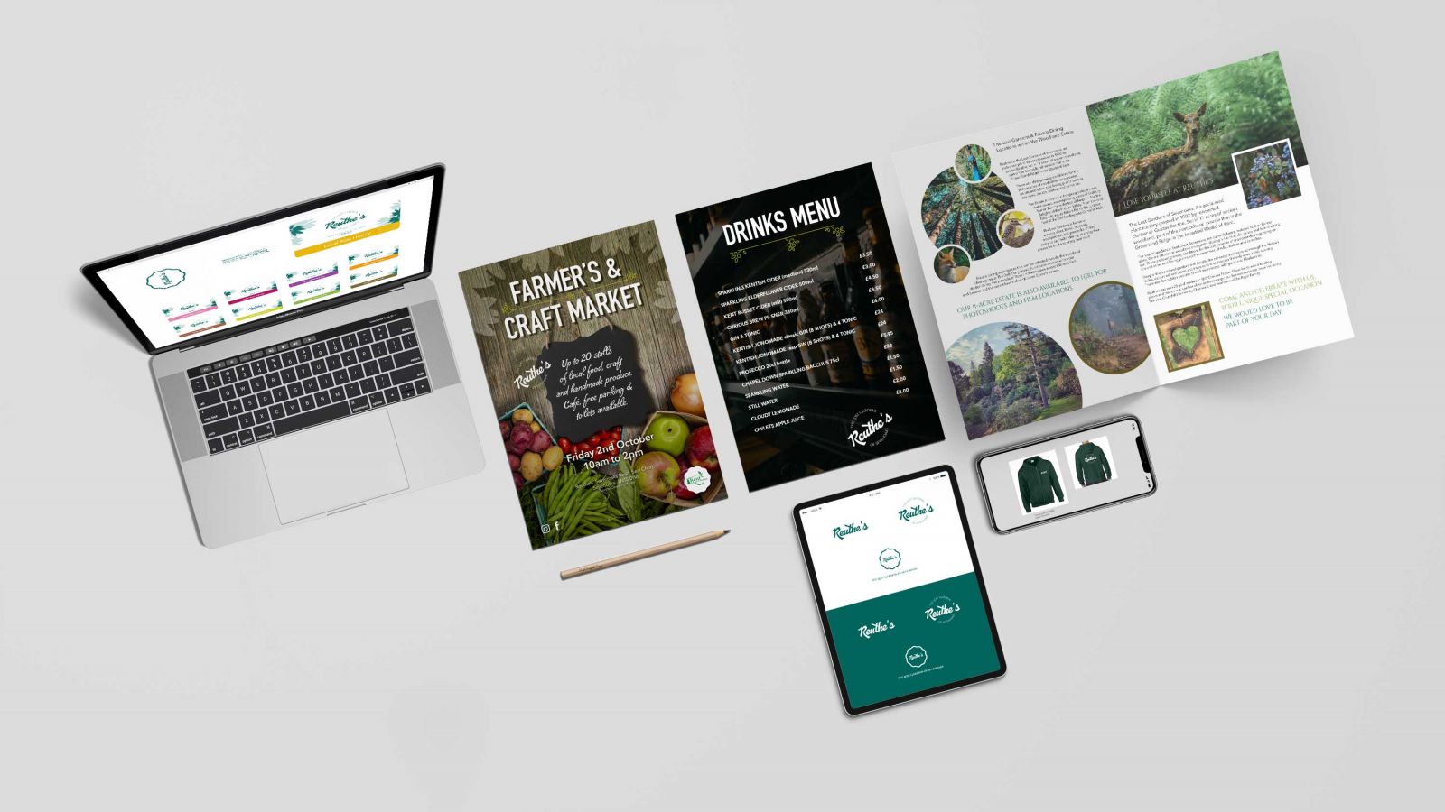
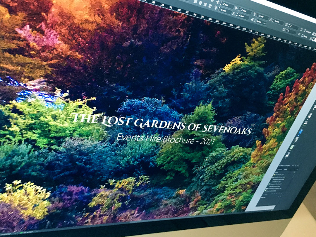
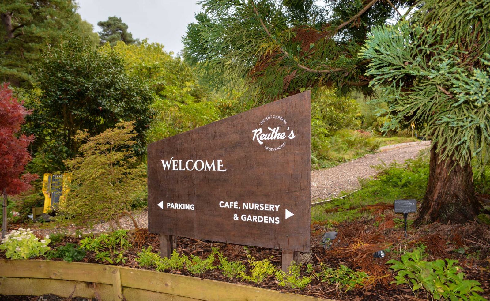
From here we had the main element to design Farmer’s Market posters, a Powerpoint poster template so it can be used/printed/laminated instantly on demand, signage, produce labels, events hire brochure and more. We are also working on site signage, café menus, packaging and labels for a special edition gin that’s distilled from highly unusual foraged fruit from within the gardens.
As the site is further restored, the trails open up and events can return, we expect to be creating more items for Reuthe's as time progresses. If you’re passing by, it is well worth a visit for the views, walks, see the Alpacas or just to sample a fine cup of coffee at the Basecamp. Plus the monthly Farmers’ Market produce is not to be missed!
or call us now on
+44 (0)1622 871192
© Vivid Pixel Creative Ltd | Maidstone Innovation Centre, Gidds Pond Way, Maidstone, Kent, ME14 5FY
Company Number 8477693 | Registered at 34 Bower Mount Road, Maidstone, Kent, ME16 8AU
This site is protected by reCAPTCHA and the Google Privacy Policy and Terms of Service apply.